From a plain landing page to a business card that sells in three seconds.
Discovery Assessoria is a consultancy specialized in European citizenship that has spent over a decade serving Brazilian families seeking Italian, Portuguese, Spanish, or German recognition — over five thousand families served, with a 98% approval rate.
Before this project, the company had an old, simple landing page — a single page with no depth, no blog, no visual narrative worthy of the brand. Anyone arriving from Google or Instagram didn't find a website; they found a placeholder.
The brief was direct: replace the landing with a complete institutional site. A digital business card for clients and prospects, with a dual mission of conveying credibility (because selling citizenship requires trust) and generating desire (because European citizenship is, above all, a dream).
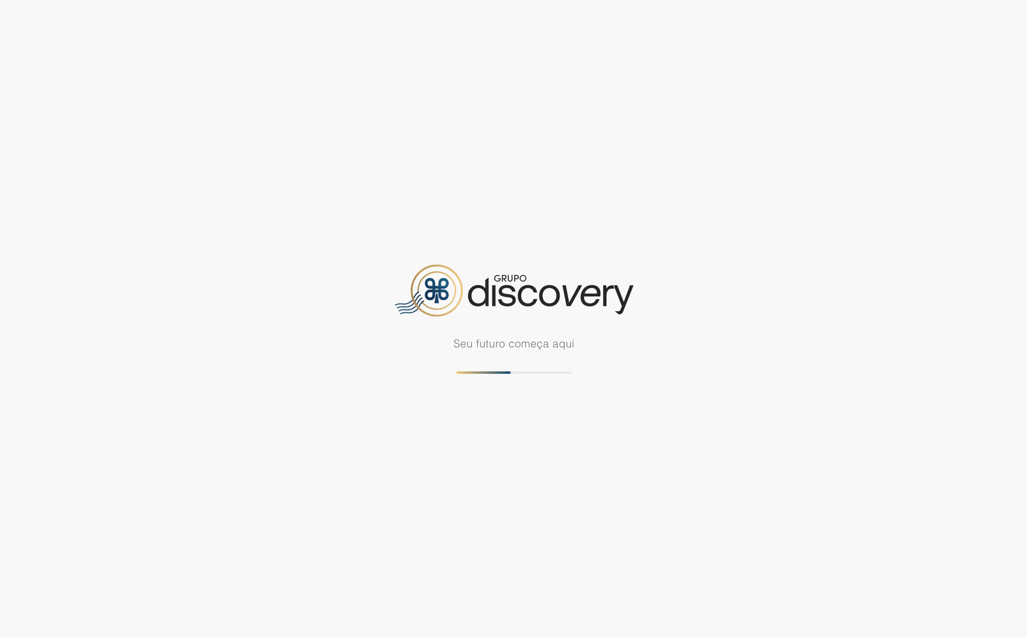
It all starts before the hero. The splash screen displays the brand centered with a progress bar in a navy → gold gradient — a small promise to the visitor: this site was made with care. Anyone visiting an institutional site in 2026 can tell when the developer stopped at the default template and when someone thought through every detail.
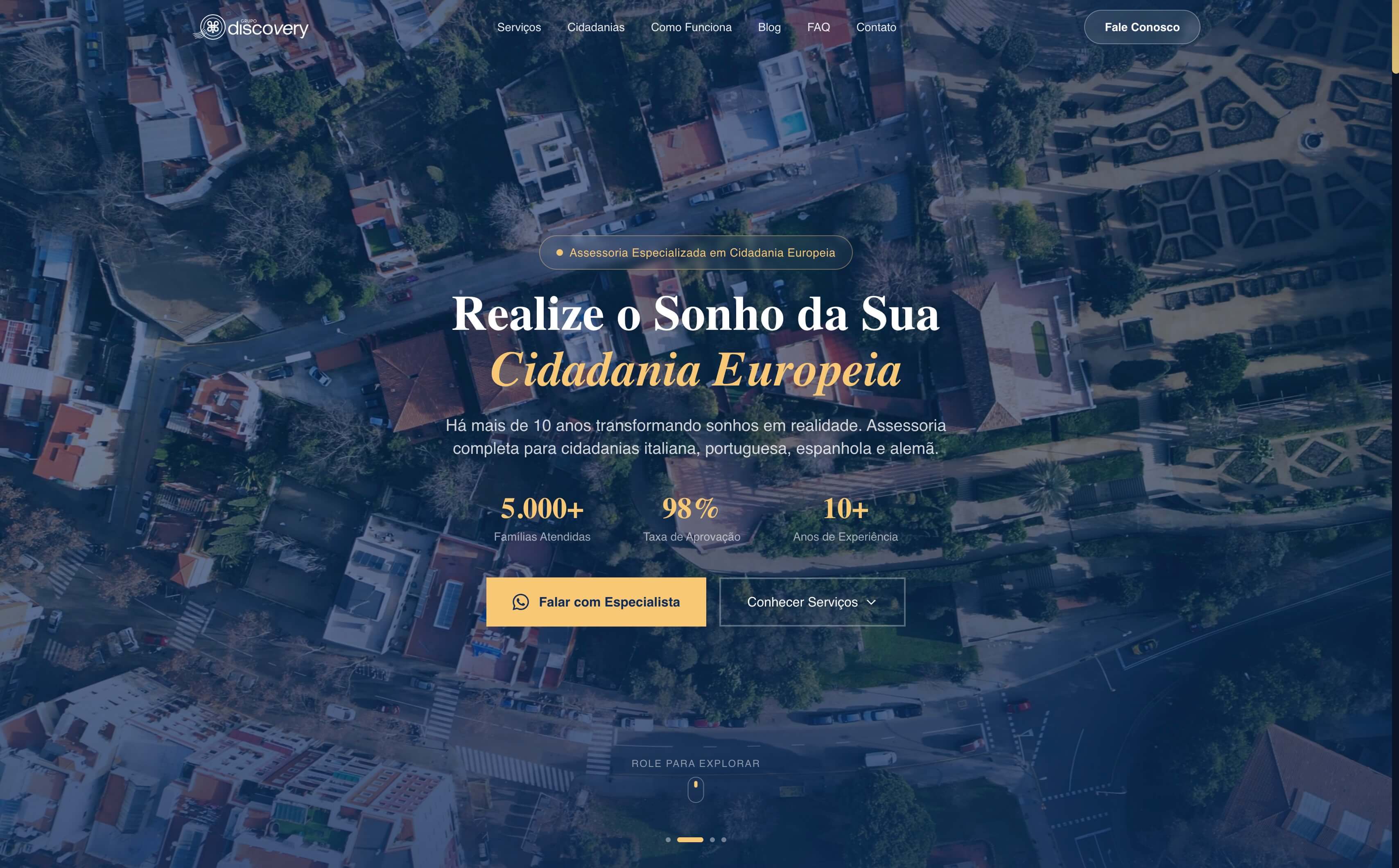
After the splash, the hero. An aerial video of Lisbon plays on loop in the background — four takes in a carousel to avoid repetition. A serif title with 'European Citizenship' in italic gold. Three stats right below — 5,000+ families served, 98% approval, 10+ years of experience — anchor credibility before the first scroll. Dual CTA: the primary leads to WhatsApp, the secondary scrolls down to explore. Those who want action have action. Those who want to understand have a path.
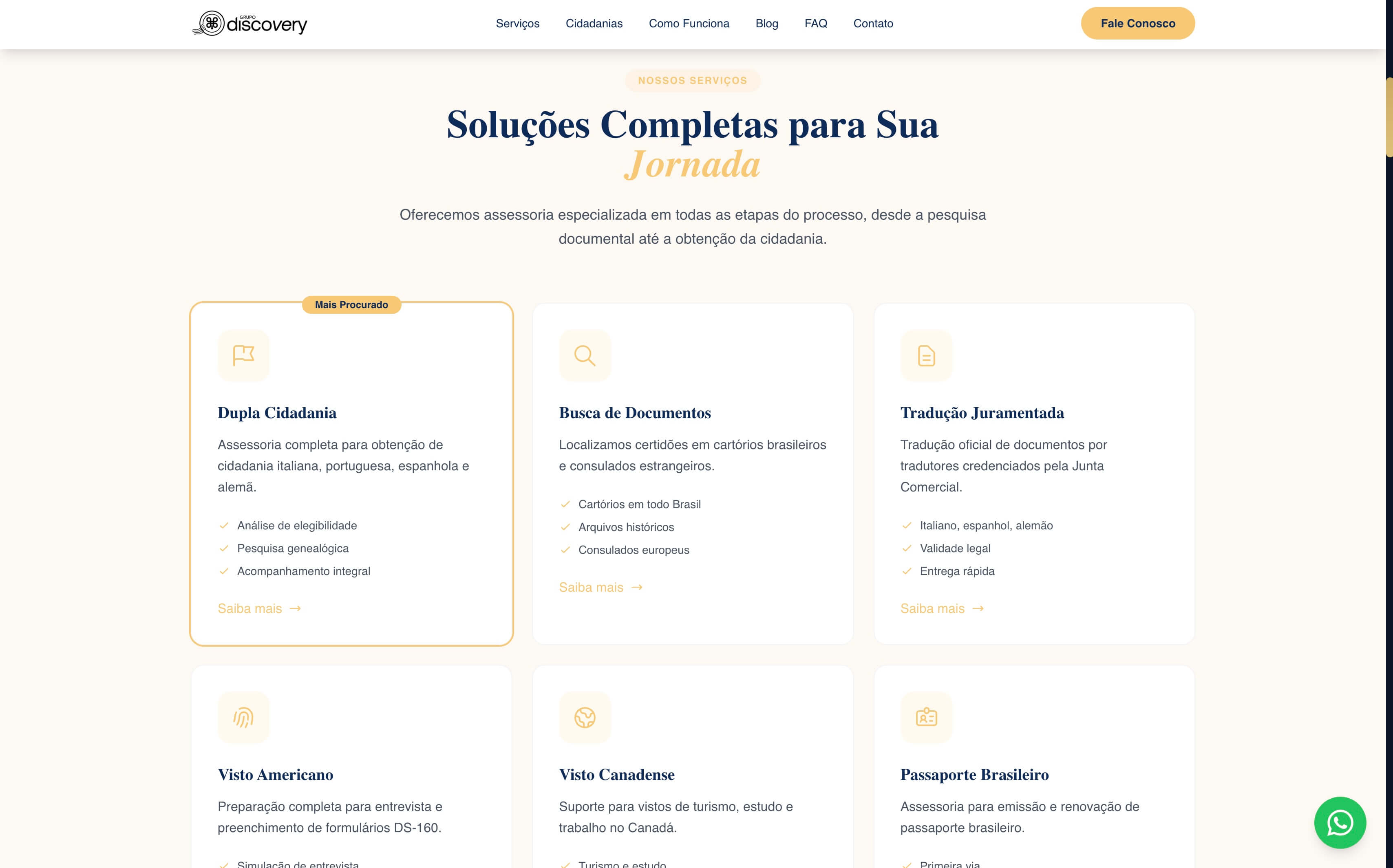
Right below the hero, what Discovery does. Six service cards in a grid: Dual Citizenship (with 'Most Searched' badge), Document Search, Sworn Translation, US Visa, Canadian Visa, Brazilian Passport. Each card combines a soft yellow icon, a navy serif title, a two-line description, and three bullet points of benefits.
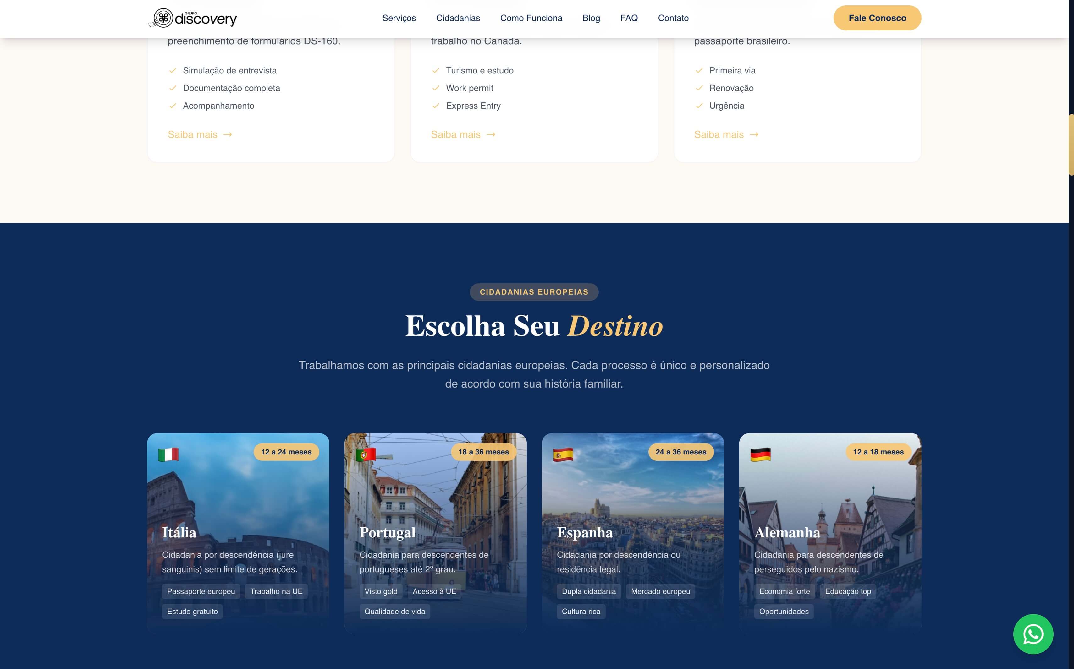
Visual rhythm break: the European citizenships block. Deep navy background and four destination cards — Italy, Portugal, Spain, Germany. Each with a capital city photo, flag, estimated timeframe (12-24 months for Italy, 24-36 for Spain), and tags of concrete benefits: European passport, job market, quality of life. The client doesn't have to decide which citizenship they want; the site helps them decide.
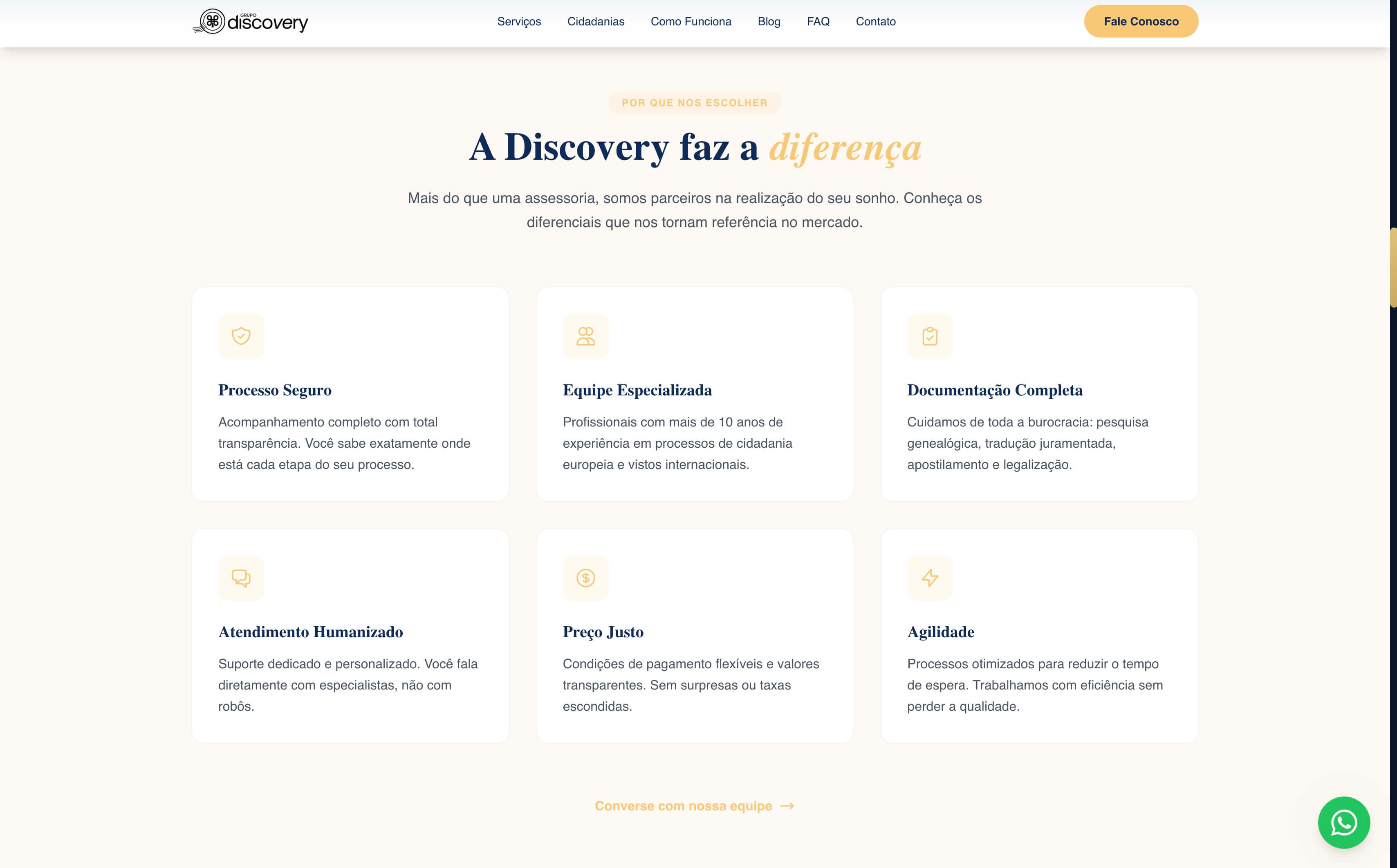
The next section answers the question every citizenship consultancy has to face: why this one and not another? Six differentiator cards answer directly: Secure Process, Specialized Team, Complete Documentation, Human Service, Fair Pricing, Speed. Each addresses a real objection — 'what if you lose my document?', 'do you really have experience?', 'how much will this cost?'. The answers come before the question.
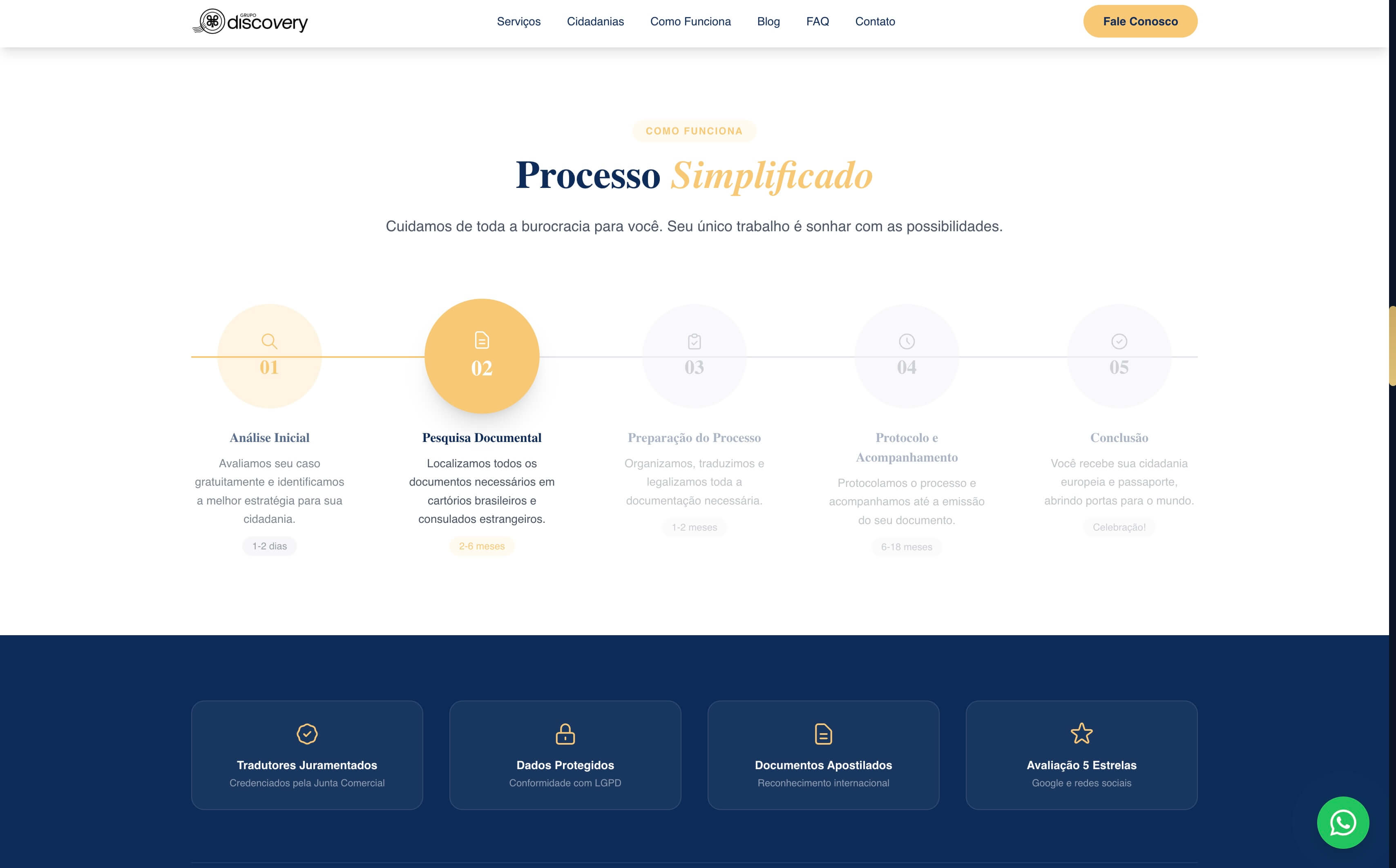
Next, the process. A horizontal timeline of five steps with honest timeframes: 1-2 days for initial analysis, 2-6 months for documentary research, 1-2 months for preparation, 6-18 months for filing, conclusion in celebration. The current step is highlighted in solid gold. The client sees not only the journey but where they will be at every moment.
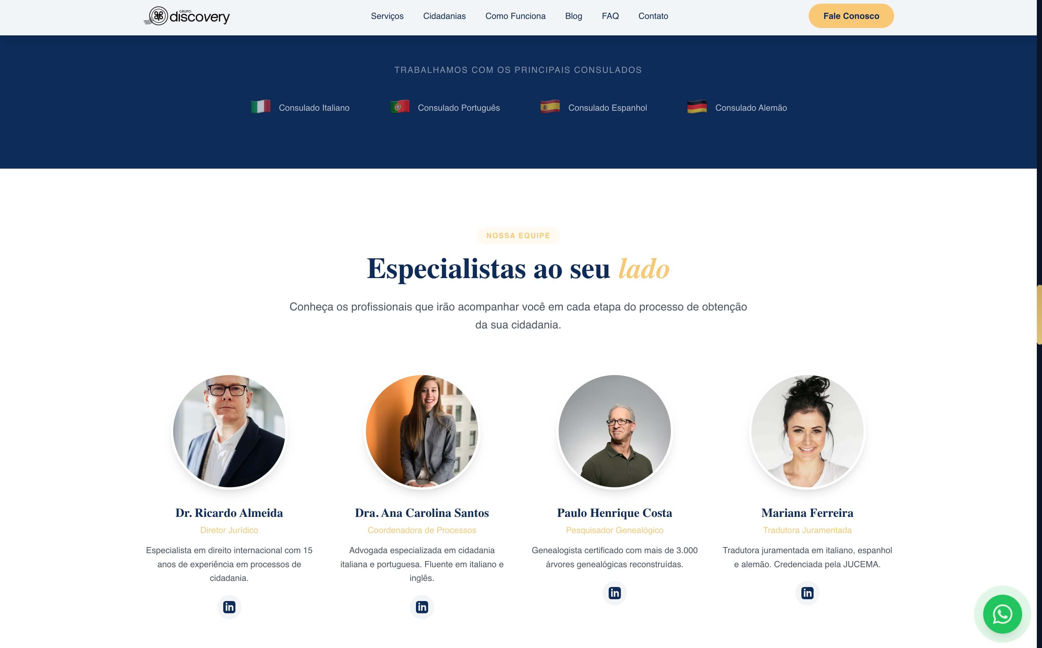
The credibility chapter closes with the team. A navy banner with the four partner consulates (Italian, Portuguese, Spanish, German), followed by four circular profile photos: Dr. Ricardo (Legal Director), Dr. Ana Carolina (Process Coordinator), Paulo Henrique (Genealogical Researcher), Mariana (Sworn Translator). Each with a short bio, specialty, and LinkedIn link. Trust in faces with names.
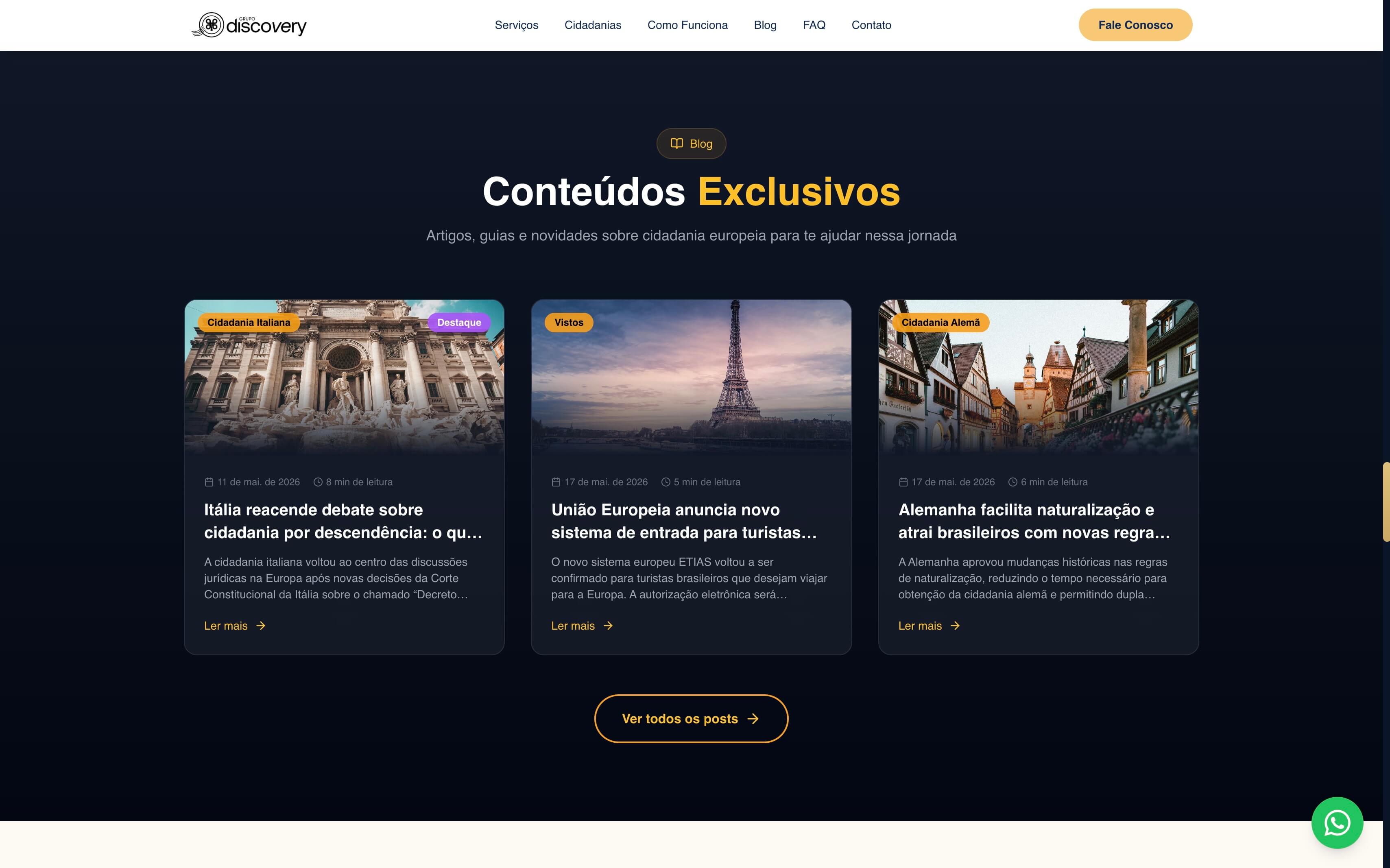
The site doesn't end at the institutional. A dark block for the editorial blog — three cards with featured image, category, recent date, reading time, and a 'Read more →' CTA. The blog is what distinguishes a modern consultancy from one with an institutional facade: continuous authority, content that indexes on Google, and a reason to return.
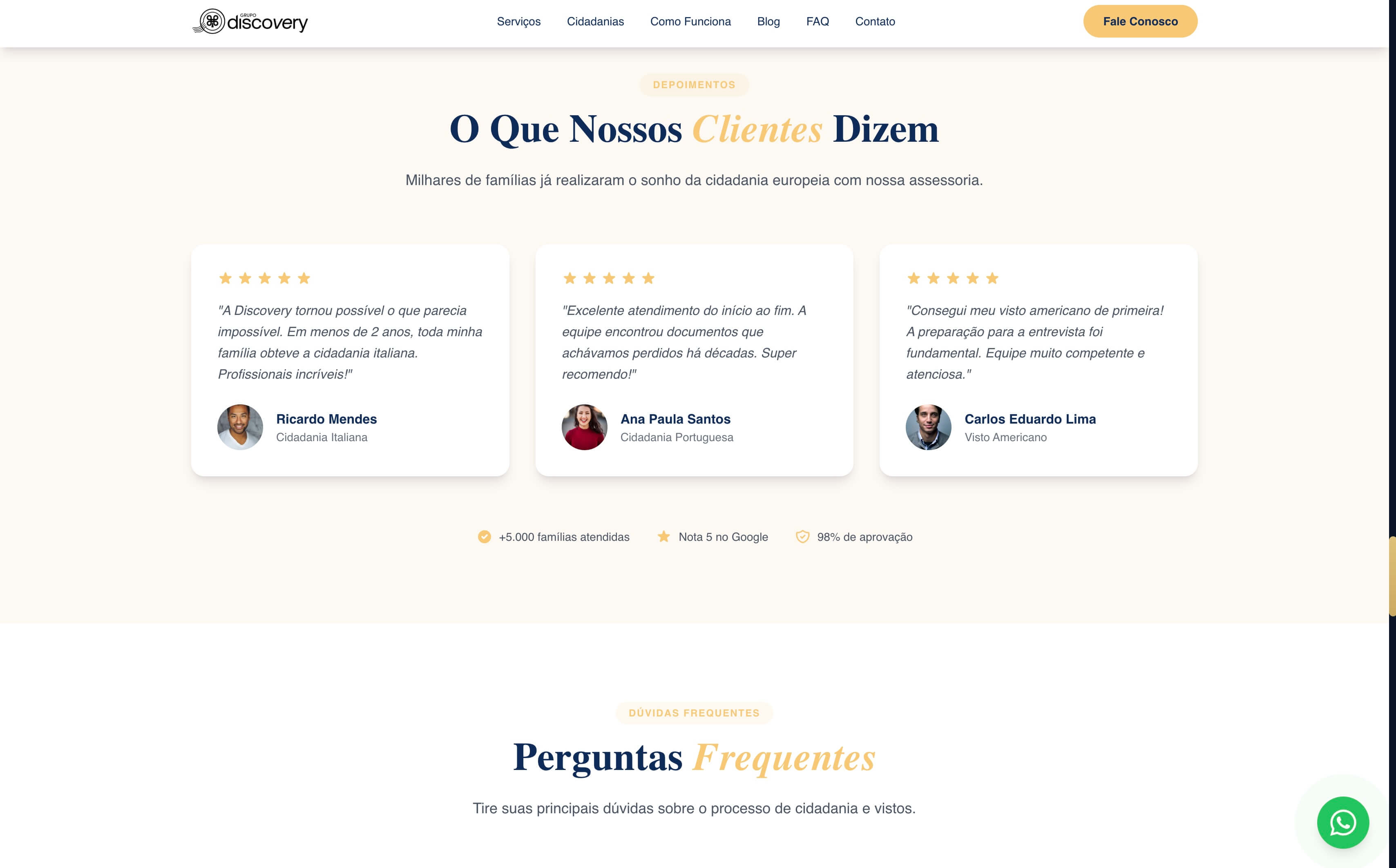
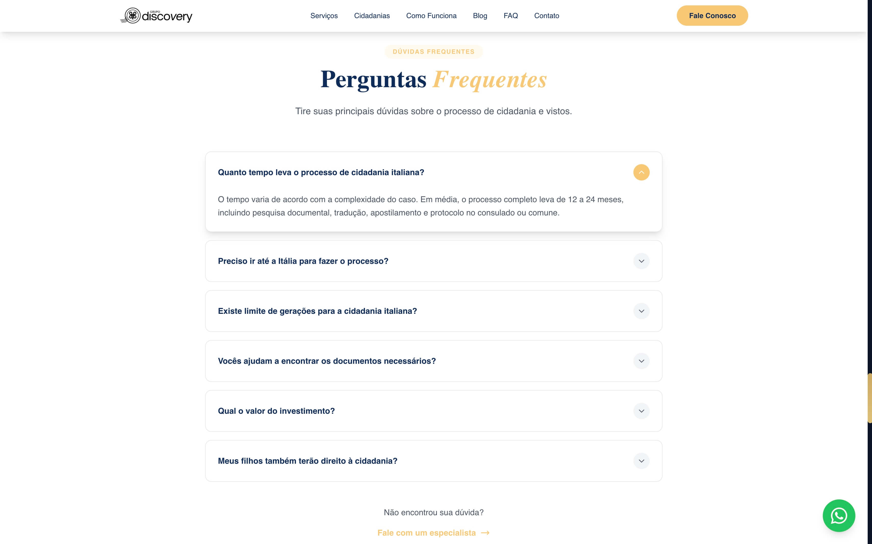
Before contact, social proof and objections. Testimonials with five stars, italicized quote, photo + client name + citizenship achieved. Right below, FAQ accordion answering what no one dares ask: how long does it actually take, do I need to go to Italy, is there a generation limit, how much does it cost, will my children also have the right. Anyone reaching the end of the page with an objection has already read the answer.
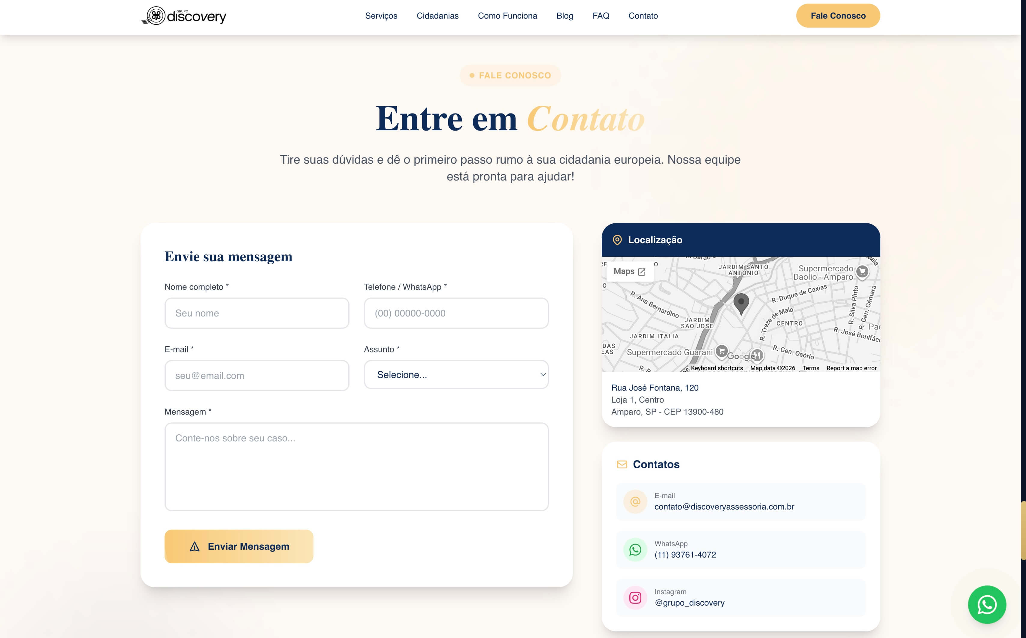
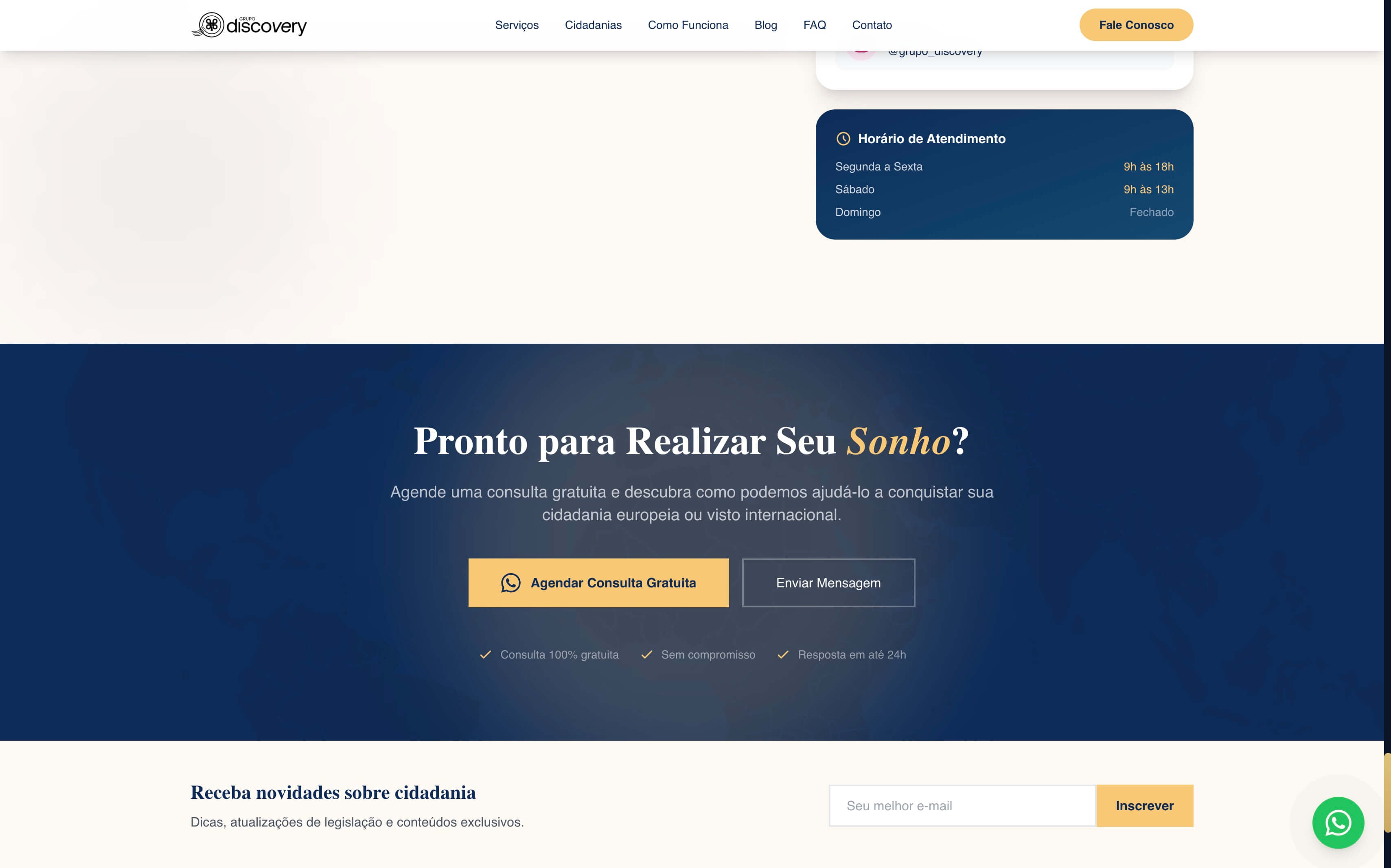
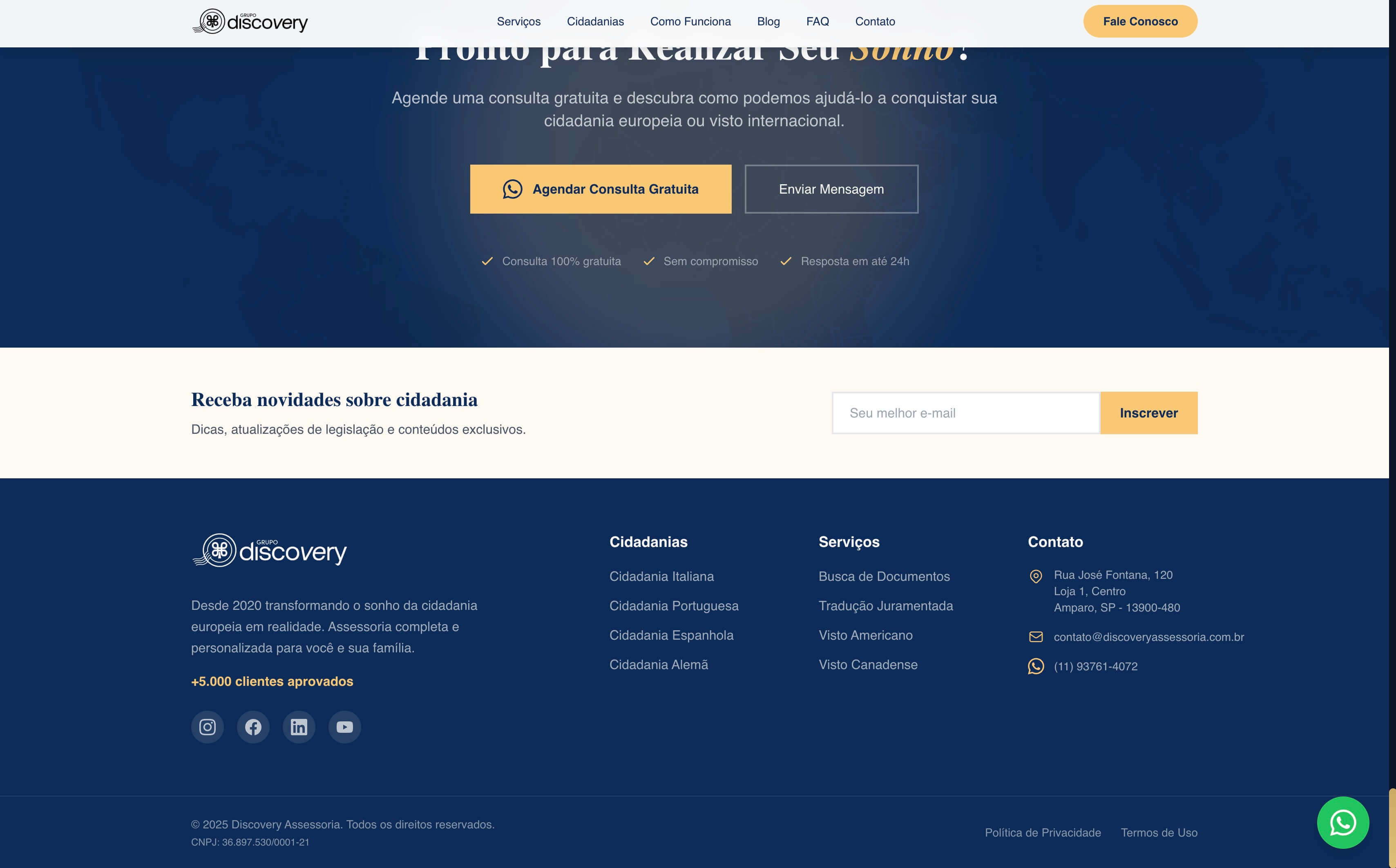
The closing is divided into three blocks with distinct functions. A complete form alongside Google Maps and contact cards (email, WhatsApp, Instagram, hours) — for those who want to send a message. A large CTA in a blue block for 'Schedule a Free Consultation' — for those who want to skip the form and go straight to WhatsApp. An institutional footer with columns for Citizenships and Services, contact, social media, and newsletter — for those who still want to absorb more before deciding.
An institutional site doesn't sell — it convinces. Discovery needed something worthy of a company with ten years in the market and five thousand families served. That was the goal: each section of the site answers a question the client was going to ask before sending a message.